The library Matplotlib can be used to create and customize figures in Python.
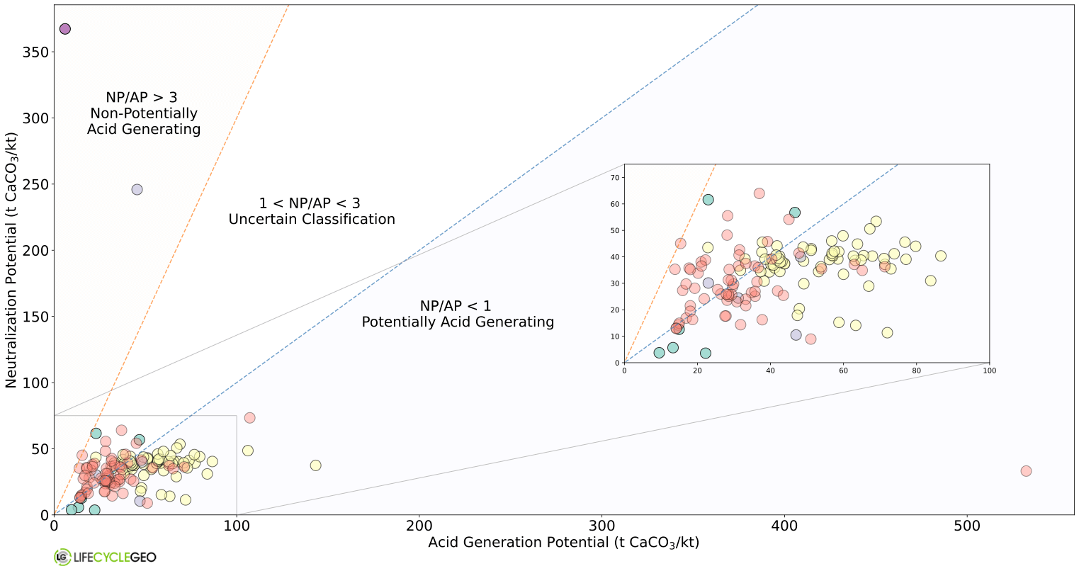
In this blog post, we will focus on the Axes class in Matplotlib which can be used to add logos, subplots, and insets to enhance your data visualizations.
Adding logos to plots:
An image of your logo is a plot of its own. It has axes and the units determine its size.
import matplotlib.pyplot as plt

im2 = imageio.imread('lcg_logo_inline_RGB.jpg')

fig, axs = plt.subplots(figsize=(5,5))
newax = fig.add_axes([0.01, 0.01, 2, 2], anchor='SE')
newax.imshow(im2)
newax.axis('off')
Here, the arguments for the fig.add_axes correspond to the position of the logo relative to your figure (x1 = 0.01 and y1 = 0.01) and the width and height of the logo (2,2). To remove the axis lines and ticks on your logo the newax.axis is set to ‘off’.
The concept of additional axes can also be leveraged to insert another plot onto your figure. However, matplotlib has functionality to include insets that are related to your plot using the zoomed_inset_axes function from the toolkit mpl_toolkits.axes_grid1.inset_locator. This is especially useful for plots with overlapping datapoints as shown below.
Give it a try and let us know if you come up with more creative plots!


Comments are closed.